
Contents: Click on Link to View
ToggleOpen the interactive report to review the analysis and do your own research
Click to view the data-set and carry out your own in-depth analysis using the interactive reporting tools
Introduction
Background
So does it make sense to take a stake in an IPO at the offer price?
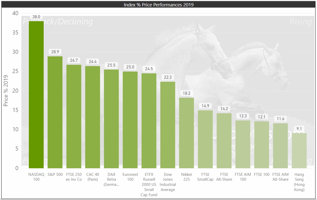
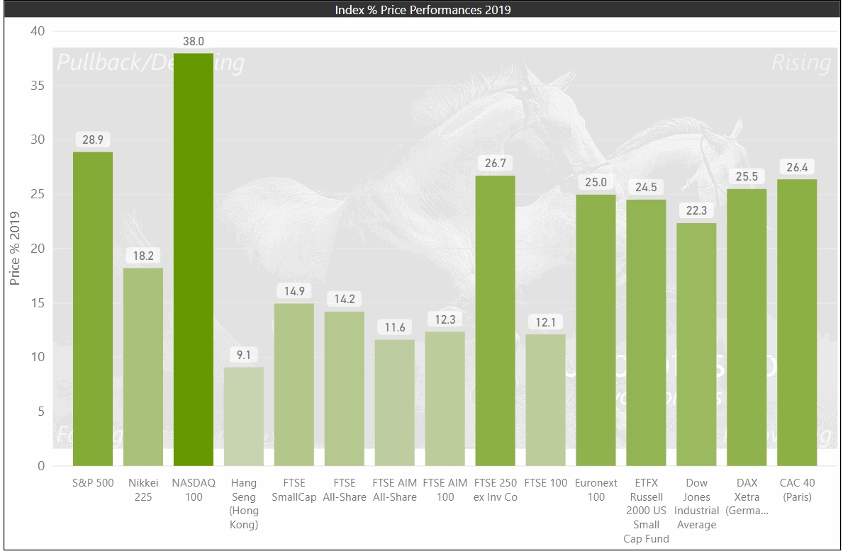
Comparison of World Index Performances 2018 to 2019
click on each chart to expand
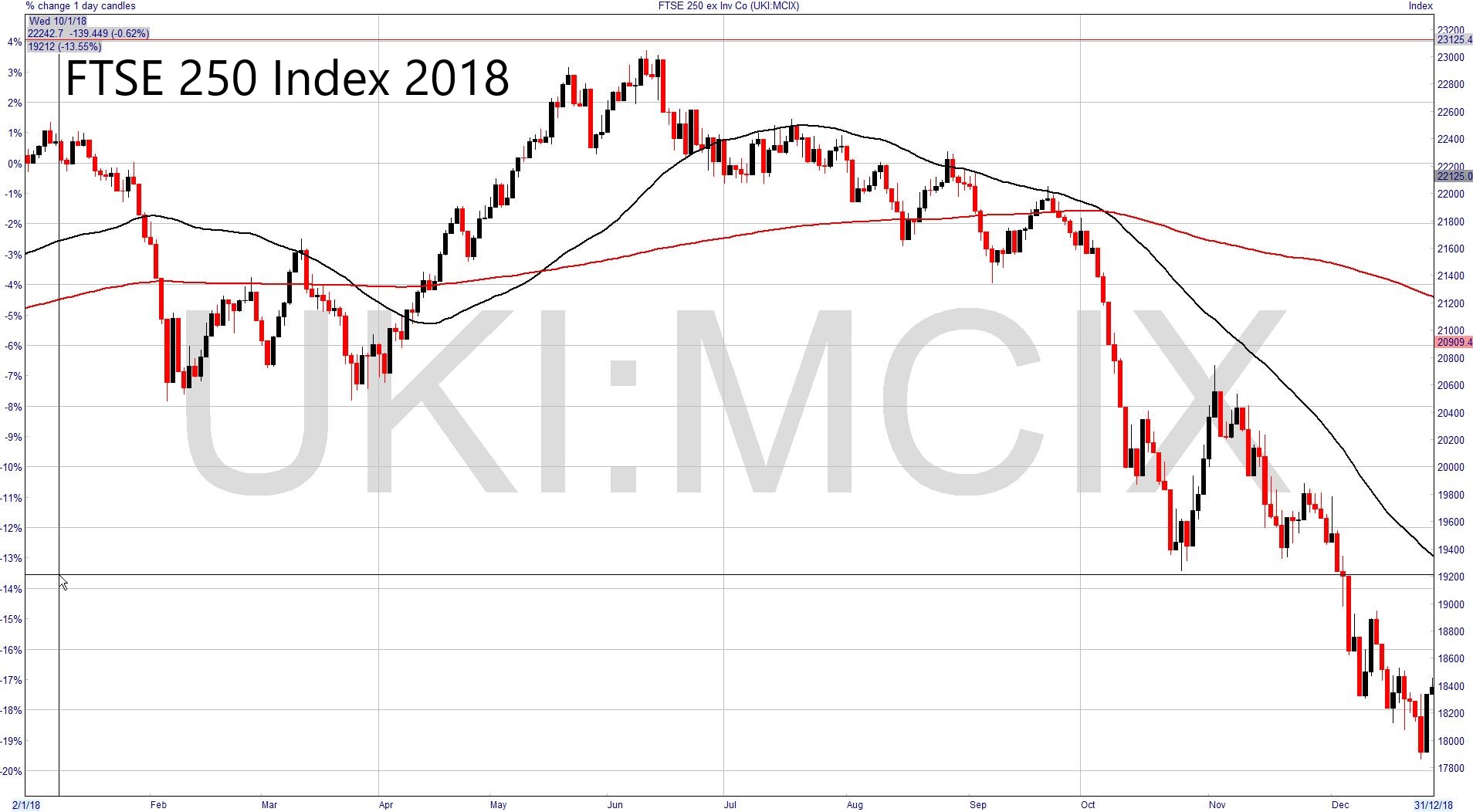
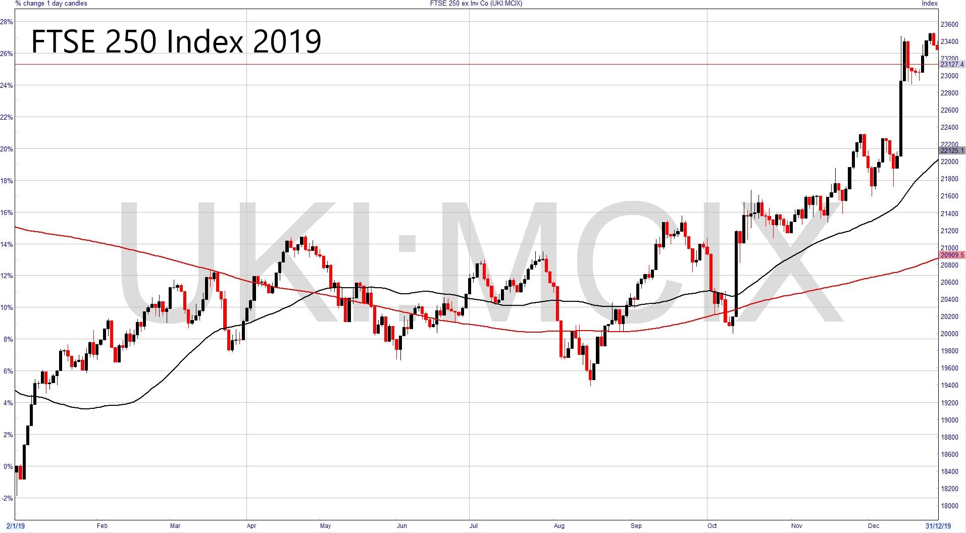
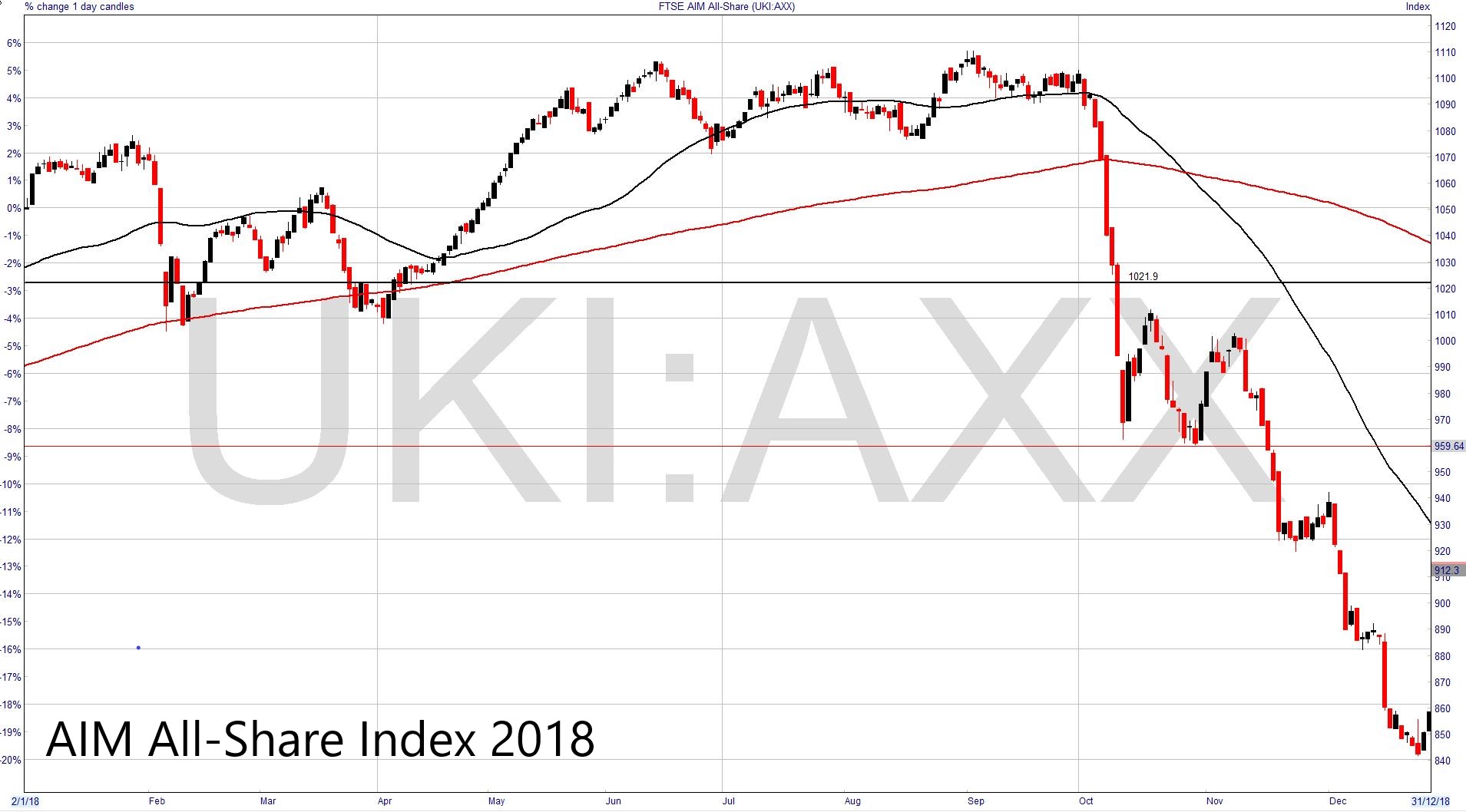
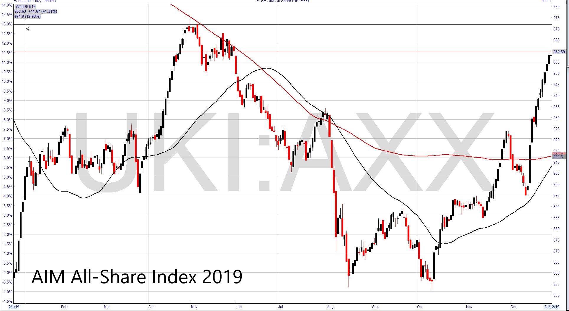
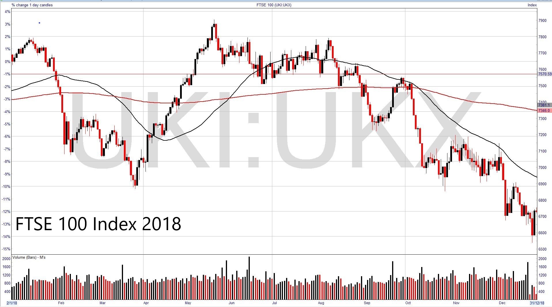
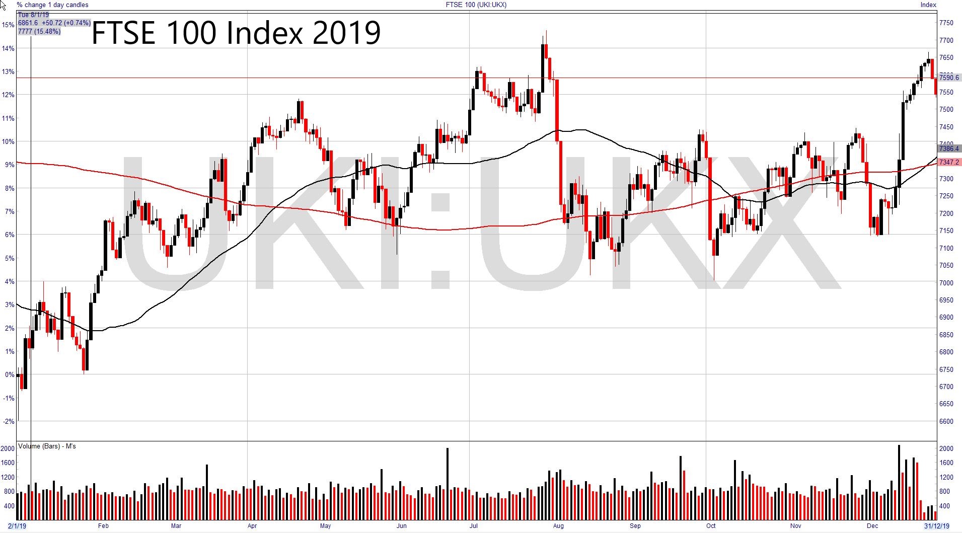
Graphical Comparison of UK Indices 2018 to 2019
Use the scroll arrows to cycle through the FTSE 100, 250 and AIM All-Share charts for 2018 and 2018
Some observations and So what?
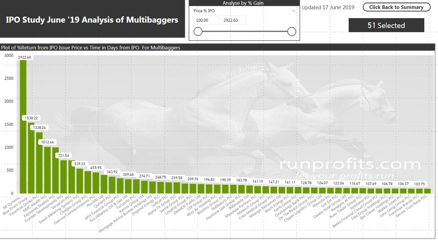
- Winners generally kept winning with 31% of winners winning really big (up to almost 3000%)
- Many of the losers went on to lose a lot with 38% of losers losing really big (>75%)
- A stop loss of 25% would have kept 143 of the 166 winners in play and only stopped-out 7 of the 51 multibaggers while removing 215 of the 230 losers.
- Given the number of highs in the first year, there is very good evidence of flipping in Year 1 possibly by both institutions and private investors.
- Taking a position in an IPO looks to be more of a traders’ game than an investors’ one (with all the caveats on quality of fundamental analysis)
The Voting and Weighing Machines
This comes back to the original question; should I take a stake in an IPO placing and is there really a danger of missing out? Only a few of the multibaggers ever got cheaper than their initial placing IPO price but all of them went on to make most of their returns several years after their placing dates. Relative to the rewards offered later on, the difference between the issue price and prices in early years suggest it might make more sense to wait for performance in the market rather than buying in the placing (Figure 7.). Indeed. a number of IPOs which did go on to be multibaggers went through periods of underperformance in the initial years and did offer better buying opportunities (BOO, BLOW, LTG, WAND). This echoes Ben Graham’s observation that in the short-term markets tend to be voting machines while in the longer term they are weighing machines. While charts are always easier to read from right to left risk management using a stop-loss should work with the majority of nascent multibaggers
The concentration of highs in Year 1 may have multiple sources. Institutional and private investor flipping may account for much of it. It is often difficult to predict the intentions of large private equity backers/major shareholders beyond lock-in periods but these can have major impacts on price performance. This is particularly true when liquidity is low owing to initial large institutional holdings. Equally price discovery in the market and changes in market sentiment may greatly impact early performance (especially when pre IPO hype gives way to even mild disappointment post-placing). An increase in the number of IPOs issued is often used to infer periods of exuberance of the overall market with potential pseudo-market timing effects (1). Finally, IPOs predicated on inflated/invented financials and sometimes overt fraud can be difficult to detect but are precipitous once discovered.
While none of the above is rocket science, the numbers do suggest that taking a position in an IPO is better viewed as a trade while an investment may be better made post IPO when the initial few years of flipping, disappointments and price discovery have played out. These conclusions are made within the obvious caveats that more rigorous analysis of individual placings should enhance success and root out the more obvious dogs.
Conclusion.
What is very clear from the data is that there are good chances of making profits from trading an IPO position bought at the placing by selling in Year 1: timing really does work. The real rewards come from allowing good trades to become better investments , trade management and the use of stop losses will support that and prevent the converse which is too often the case when holding on to, or even adding to, losers. My opinion on IPOs has changed, from now I’ll take an informed position but trade it until it proves otherwise.
In the next article in this series I will dive into the multibaggers in more detail and characterise what good looks like as well as the importance of trade execution and management.
Appendix: A note on Sectors, Countries
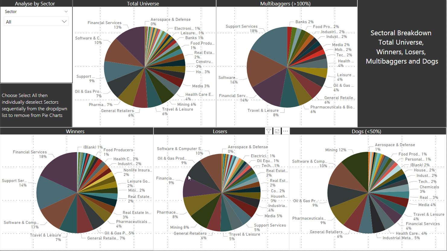
The total universe of 408 was analysed by sector country and market as were the winners and losers to examine sector and country over/under-performance. Junior oilers and miner are fairly notorious for overpromising and under-delivering with sometimes spectacular losses. Many investors will shun companies from some countries owing to track records of frauds and limitations on prosecution in the event of fraud.
Figure 8 shows that more of the winners came from Financial Services, Support Services with an even more pronounced concentration of Support Services and Software companies in the multibaggers. Mining and oil and gas producer did concentrate in the losers with the ratio of mining doubling from 6% in the total universe to 12% in the dogs;
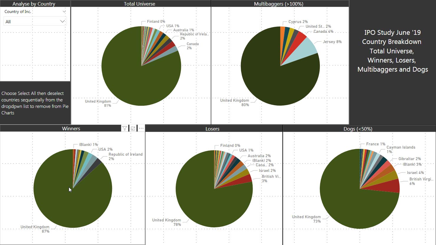
Figure 9 shows a similar segmentation by country, I suspect that this would change further if the 130 delisted companies were included since it contains several from Israel and China which have proven to be frauds. The plot shows a doubling (albeit from a low base ) of Israeli and BVI companies in the dogs : the percentage of UK companies increased from 81% in the total universe to 87% in the winners and decreased to 73% in the dogs. This does seem to confirm the bias against companies from these countries.
Notes
- There are 133 companies that listed in that period and subsequently delisted in the intervening years: many of these have been acquired (Poundland, Jimmy Choo, TSB) while many more ( Naibu, MySquar, Patisserie Valeria) were frauds. I've excluded that list from this analysis but may revisit later to update the data set although that needs much qualitative analysis
- the performance of the placings have NOT been corrected relative to the underlying markets – so at the time of this analysis, from 2011 to 2019 the FTSE All-Share has risen 31.6% while the AIM All-Share is up just 1% and the FTSE 100 up 15%. Given the different timescale of the placings, the relative corrections to underlying markets would have been pretty time consuming.
- Relative performances have been derived using time from IPO date: this will be skewed to some extent by more recent data: 30% of the total sample were placed in the last 3 years (removing these drops the median return to -24% for the total universe )
Summary
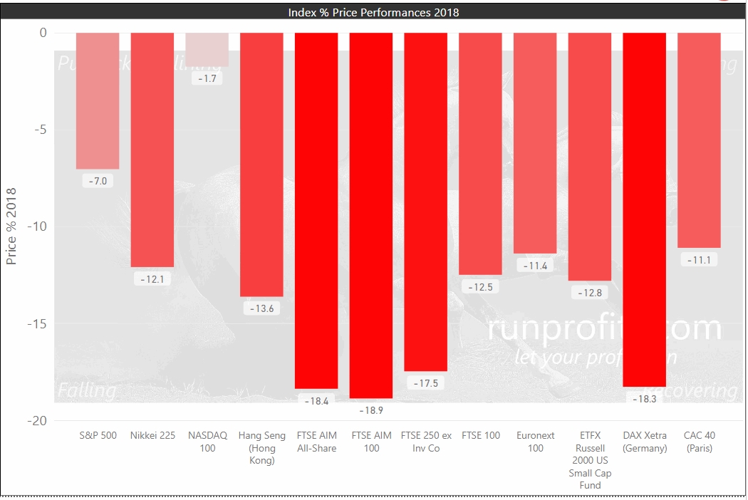
2019 saw the UK markets bounce back with double digits gains across all indices and the FTSE 250 ranking third in the world in terms of performance adding almost 27%. On the face of it, this would appear to be a stellar bull year with a rising tide lifting all boats . The backdrop of diminished fears of global recession, increased monetary accommodation by major central banks and the lifting of the Brexit cloud of doom all aided the UK markets in climbing to what appeared to be an insurmountable mountain of worry at the end of 2018.
This article takes a look beneath the numbers and contextualizes the outperformance in terms of recent years. We'll then look across the small to large cap landscapes and scrutinise the relative performance of the various sectors to identify what worked, what didn't. This helps set the context for 2020 and in Part 2 of this series, we'll do a deeper dive to look at the leaders, laggards and the potential opportunities these may identify for 2020. Part 3 will weave in some of the macro insights for 2020 and summarize some of the forecasts from leading financial institutions such as Goldman Sachs, JPM etc. These will help to form market assumptions and identify potential themes for 2020
These articles and the underlying data combine to help develop evidence based hypotheses and inform trading and investing decisions in 2020: these can be challenged and revised as the year plays out. The intention is to revisit this study every quarter in 2020 with a refresh of the base data and a reappraisal.of the market assumptions.
The performance data for UK indices, sectors and shares over 2019 is included in a fully interactive 56 page report which covers 1380 shares in the 41 UK sectors. This allows individual analysis and interrogation of the underlying data using powerful visual data mining techniques to enable bespoke research and data-driven insights. The report is available at the link below and will be referenced by all 3 articles and updated throughout 2020.